I have the luxury of falling in love with reading again. It’s been an intellectual journey, yes, but also a physical one: curling up with books on couches and lounge chairs. Primping pillows just right to be comfortable and well supported, balancing books on my bent legs and knees. Reading today has been recursive, slipping me back and back and back, to college, to high school, to childhood(–)reverie.
Just reads: Lolita by Vladimir Na-BO-kov; Are you my Mother? by Alison Bechdel (insert joke about test fame here).
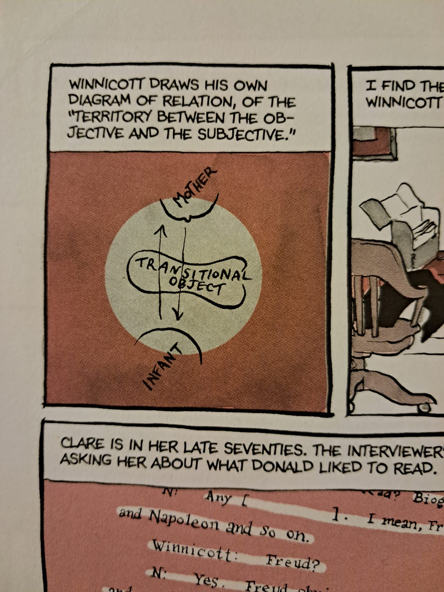
While provokes me to write is a (perhaps tenuous) connection between the two. or rather, how one text has provided insight upon another. Bechdel’s memoir spends a good deal of time working through psychoanalytic texts to examine her, her mother, her relationship with her mother. She spends a good deal of time explaining the work of Donald Winnicott (seems like a cool dude). What struck me was this piece of Winnicott’s theorization:
From Are You My Mother? p. 258
It only struck me again when leafing through The Annotated Lolita, when I stumbled upon a key passage in the book, where Humbert cops to falling in love with the fiction of Lolita. The jist is this: Humbert realizes that he did not love Lolita (Dolores) but Lolita (the fictional being), and said fictional being lies between Humbert and Dolores:
“What I had madly possessed was not she, but my own creation, another, fanciful Lolita — perhaps, more real than Lolita; overlapping, encasing her; floating between me and her, and having no will, no consciousness — indeed, no life of her own” (L 62).
As I reread this, it occurred to me. Is this Lolita object the same as the transitional object, that comes in between the subjective (Hmbert) and objective (Dolores, in Humbert’s view)? If so, this would form a funny challenge Nabokov’s critique of psychoanalysis in the novel. But, perhaps, the joke is on Humbert, who toys with psychoanalysists and psychoanalysis altogether (“pseudo for pseudolimidos””pseudoliberations of pseudolibidoes,”) only to be a case study for the field.
This is a simplistic connection, and a probable misreading; to substantiate it would take a lot of work at present I doubt I would be able to complete. But I jot this down to mark it in my mind, and also observes the ways in which texts can speak to each other, and to us. They change us, move us, shape us. For me today, these books kept me thinking, reading, and now writing (blogging!) Fun fun.
This was written in response to a recent thinkpiece in The Cut which argued that the embrace of the girl is fundamentally regressive, or at least, politically stultifying.This is an unabridged version of a comment I have left on that article.
The scholarship and political writing on the figure of the young girl and girlhood as a whole varies. While there are differing interpretations on what girlhood can offer, I will argue that girlhood offers a radical space to break away from toxic patriarchal norms and instead embraces alternative aesthetic expression and community.
Scholars like Catherine Driscoll and Heather Warren-Crow identify how girlhood is socially envisioned as a site of transformation and plasticity. Girls as a social construct are always already becoming. For Warren-Crow, such becoming entangled with digital images; thus, digital images are girlish in their plasticity. There is a tension between whether such malleability of girlhood is liberatory, or merely makes us more supple to capitalism’s demands. Warren-Crow argues that that such plastic girlhood has the capacity for both. Certainly this article embraces the negative, somewhat akin’s to political collective Tiqqun’s analysis of girlhood. Working a negative and arguably girl-phobic vein, Tiqqun’s Preliminary Materials for a Theory of the Young-Girl argues that the young-girl is the ultimate figure of a good capitalist consumer. For Tiqqun, the figure of the young-girl operations as as “molecular diffusion of constraint into everyday life” (2012, p. 11).
I would emphasize the liberatory aspects of reclaiming girlhood. Girlhood is a space for what Kathryn Bond Stockton calls “growing sideways,” a means of growth outside the typical patriarchy norms. Girlhood is a kind of free space that enables an escape from the toxic norms of patriarchal adulthood, or at least a reprieve. We can see the political capacities of girlhood by looking at one of the ultimate girl media: magical girl anime. Magical girls fight with their femininity, adorned in all the trappings of girlhood, including bows, skirts, sparkles, and more.
In Kumiko Saito’s analysis of magical girl anime, she examines how Japanese gender roles are reflected in the magical girl genre across the decades. In the most recent iteration of magical girl works, Saito finds that girlhood is embraced as a means to resist and delay adulthood in all its constricting gender norms. While Saito, in my view, leans a bit negative in her analysis, nonetheless, she finds there is some kind of critical capacity in girlhood for resisting normative conceptions of maturity.
By contrast, Kevin Cooley examines the magical girl anime Madoka Magica for how magical girl anime in its very construction (empowered girl heroes decked out in girlish decor) centers power in the feminine. For Cooley, the trappings of conventional femininity (narrative and visual) are inverted to make these series always already queer. In other words, the girlish aesthetics produce radical political potential in envisioning queer forms of life, and I would add more broadly, femme agency and power.
The crucial thing we must resist is framing the embrace of girl aesthetics as regressive, that to be girly is to regress in terms of maturity and growth. Again, rather than framing this as a kind of failure, instead, following Stockton, we can think of this in terms of finding alternatives to regressive and restrictive social norms. I think Barbie, among other girl media, have reinvigorated this search for alternative ways of being. We can see such in the work of Andi Schwartz, who examines how new expressions of femme identities emphasize girly aesthetics. Such aesthetics embrace softness, tendering, and radical vulnerability, producing emphasis on communities of care. Rhea Ashley Hoskin similarly finds power in the femme, arguing that the soft can be made powerful. Softness, the pliability assessed by Warren-Crow that has the potential for compliance under capitalism, is positioned as a crucial element for producing new communities of care.
Do not fear the girl; instead, embrace her with open arms. While we can remain critical of capitalism’s capacity to commodify and undermine political work, we can also that offer (aesthetic) alternatives in political agency and expression.
Unlike my last post, where I struggled to come up with even one comic that made me cry, I had the opposite problem here. Almost every comic I remember connects to someone I know or knew at the time. I decided to pick a comic that I basically only remember in relation to another person. Someone who is quite dear to me.
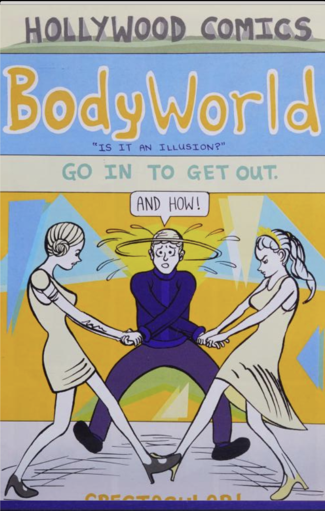
To be frank, I remember that Dash Shaw’s Bodyworld has something to do with a horrific near future and a magic plant of some kind. I think the main character studies plants? I could be getting it mixed up with Jeff Vandermeer’s Annihilation, which I read a few years after Bodyworld, but I think I’m right. The only thing I can really recall about this book is that it has a lot of Dash Shaw’s famously beautiful and oddly crafted images in it. Plot beats and…
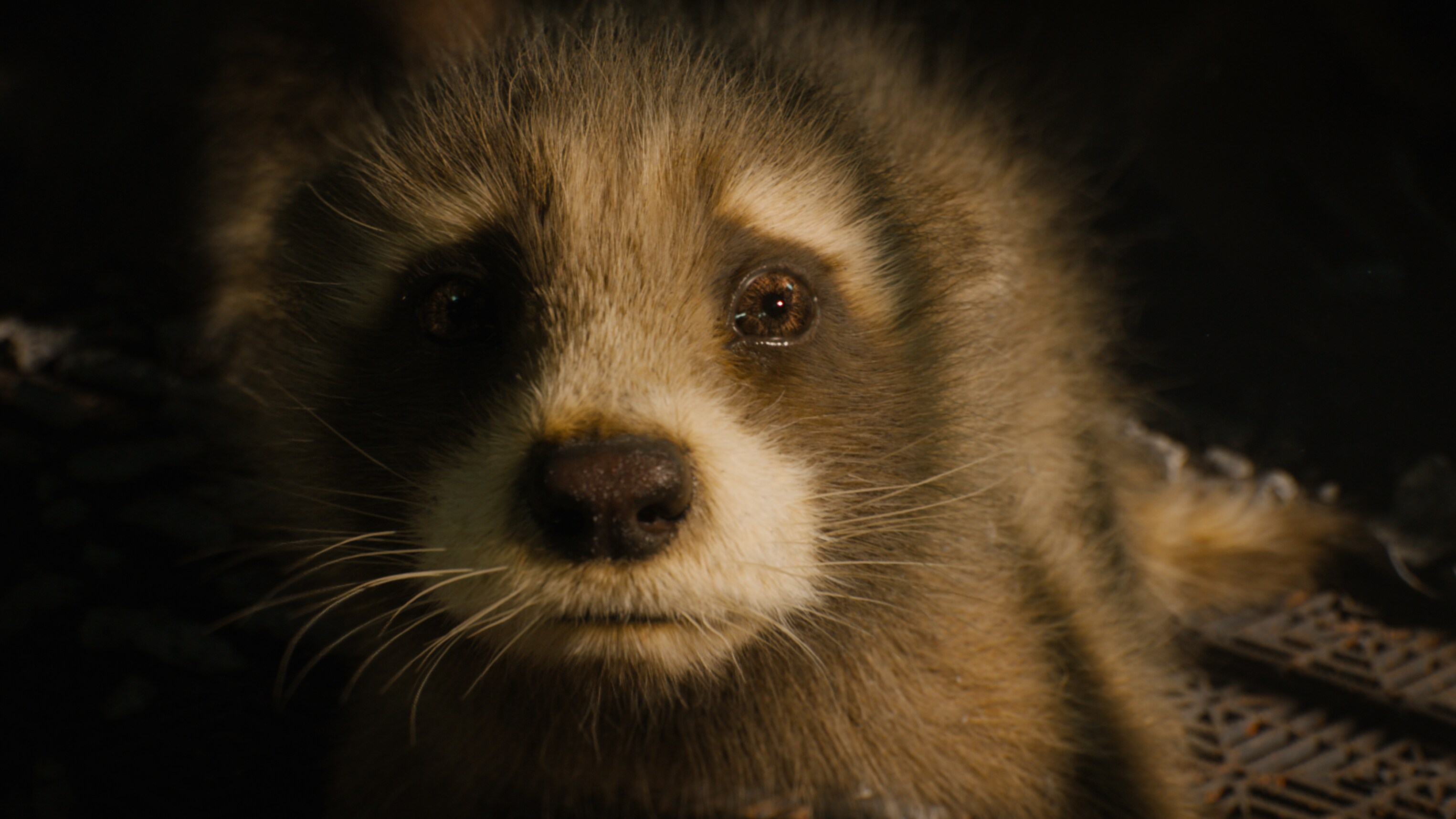
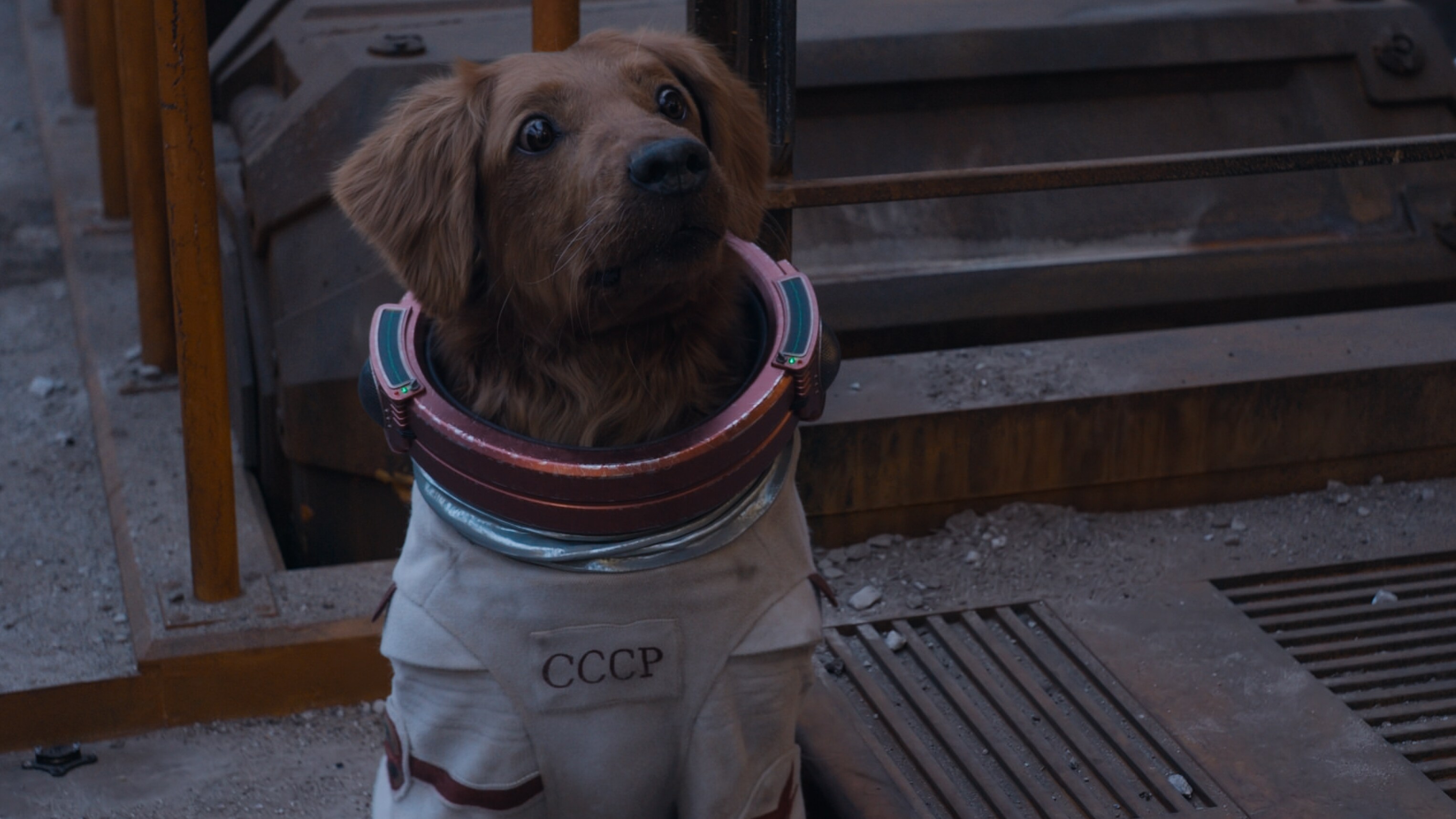
A young Rocket Racoon in Guardians of the Galaxy Volume 3 (James Gunn, 2023).
So, with Guardians of the Galaxy Vol. 3 (James Gunn, 2023), it’s official: the GotG trilogy are the best films in the Marvel Cinematic Universe (MCU). They have colour and creativity, using the space setting to present actually strange and fantastical worlds and characters. This space for creativity also enables the series to grapple with profound challenges and weighty ideas, such as found families, cycles of abuse, and identity formation.
Or at the very least, these films are the most interesting MCU films, for the aforementioned reasons. With Guardians of the Galaxy Vol. 3 (hereafter GotGV3), director James Gunn pushes the aesthetic and ideological contours of what modern blockbuster filmmaking can be. Similar to his DC show Peacemaker (2022, on HBO Max), this film continues the exploration of found families, and specifically, what it means to make kin with the non—human.
By “making kin,” I am drawing from Donna Haraway’s 2016 book Staying with the Trouble: Making Kin in the Chthulucene, which argues for a future of forging relationships with humans and non-humans alike for future survival. Making kin is turned away from the typical heteronormative reproduction (that family is blood family); instead, to make kin is to move past ancestry and towards forging relationships beyond blood and species altogether. To make kin is to be in relation with animals, plants, fungi, trash, etc. It de-centers the human from our anthropocentric view of the world, and instead open ourselves to vulnerability. It’s about solidarity, not solitude.
GotGV3 is full of moments where characters are making kin across species lines. While the series has already featured found families (families beyond species and blood lines), this final volume amps up such kinship making even more through the main storyline of Rocket Racoon. GotGV3 is Rocket’s film, as much of the film centres around his backstory and the Guardians—his family—rushing to save his life. We learn in flashback that Rocket was experimented on by the High Evolutionary (Chukwudi Iwuji), who seeks to create the perfect species. We as viewers are moved to care about Rocket and his fellow animal friends, the otter Lylla, the walrus Teefs, and the rabbit Floor. Rocket’s friends are cyborgs, with robotic limbs and other metal bits enjoined to their bodies. We witness their moments of joy in their cramped metal cages as they name themselves, and envision a future for themselves they sadly don’t get to live out. Rocket’s friends don’t make it, cruel cut down by the High Evolutionary and his flunkies; Rocket escapes by the skin of his teeth with a shitload of trauma. Rocket’s journey throughout the film, from his formative moments with friends in flashbacks, to his rescue of animals from the High Evolutionary at the end of the film, is a character arc teaching us how to make kin, how to value life outside of our own species.
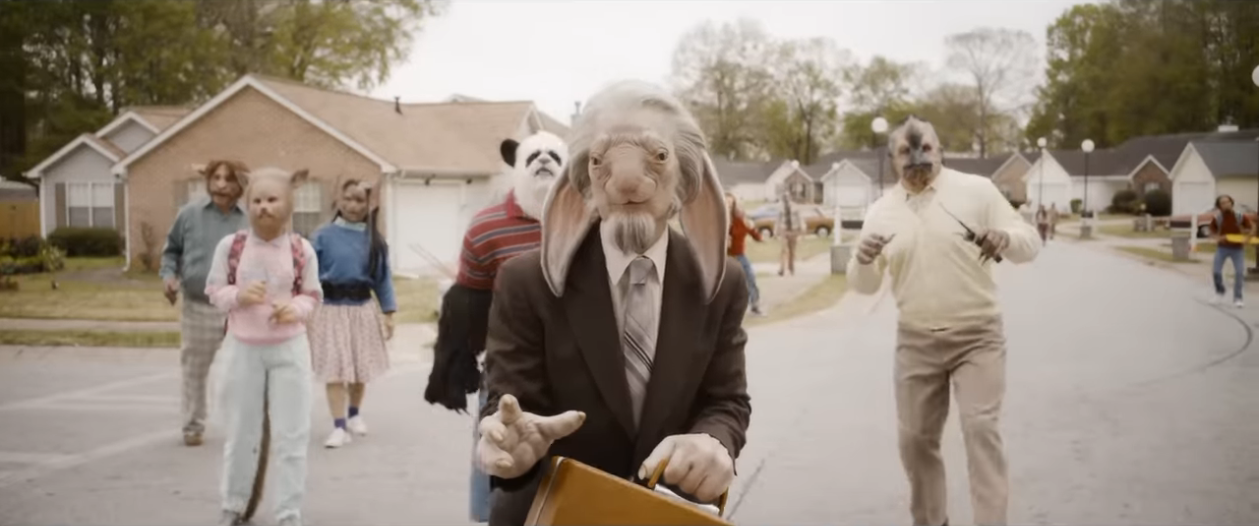
As Haraway argues, “Kin making is making persons, not necessarily as individuals or as humans” (103). We see kin-making not just in Rocket’s journey, but through the film. In one encounter, some of the Guardians are confronted with Abilisks, frightening, toothy aliens the Guardians grappled with in the opening sequence to GotGV2. The Guardians first gear up for battle before Mantis, an empath, steps back and recognises these beings are likely just as afraid as they are. Finding a space between their giant pointed teeth, Mantis makes contact—makes kin— and calms the being down. Such a moment crystalizes what it means to make kin, to open yourself up to vulnerability and seek to address other beings not as problems to be overcome, but beings to be understood. Indeed, trying to understand other beings is a thread throughout the film. A good chunk of the film is spent on Counter-Earth, the High Evolutionary’s would-be paradise replete with anthropomorphised animals. The Guardians try to communicate with these beings and, after a few hiccups, are able to the win the trust and get crucial information for their quest to save Rocket.
While their initial encounter is a bit bumpy, the Guardians eventually work with the anthropomorphized animal beings to save Rocket.
Similarly, the film also pushes towards making kin with other species while overcoming traditional conventions of aesthetic beauty. Much as Mantis makes kin with the fearsome Abilisks, and works with them to help defeat the High Evolutionary’s operation, other species encounters ultimately encourage making kin with those deemed conventionally ugly. In the climax of the film, the Guardians free the diverse, captive species in the High Evolutionary’s stronghold. This includes a range of beings of all shapes and sizes, including humanoid children who look like a cross between the kids of Village of the Damned (Wolf Rilla, 1960) and Ikea, various Earth animal species, and other creatures who may or may not have gone under experimentation. In one encounter, as she opens the cages, Mantis initially screams at a short, slimy, sentient being, before covering for her rudeness by saying she was surprised by something else. (Lest we forget, Mantis was once told she was ugly by Drax in Vol. 2.) In this encounter, Mantis tries to be respectful for another being regardless of their appearance.
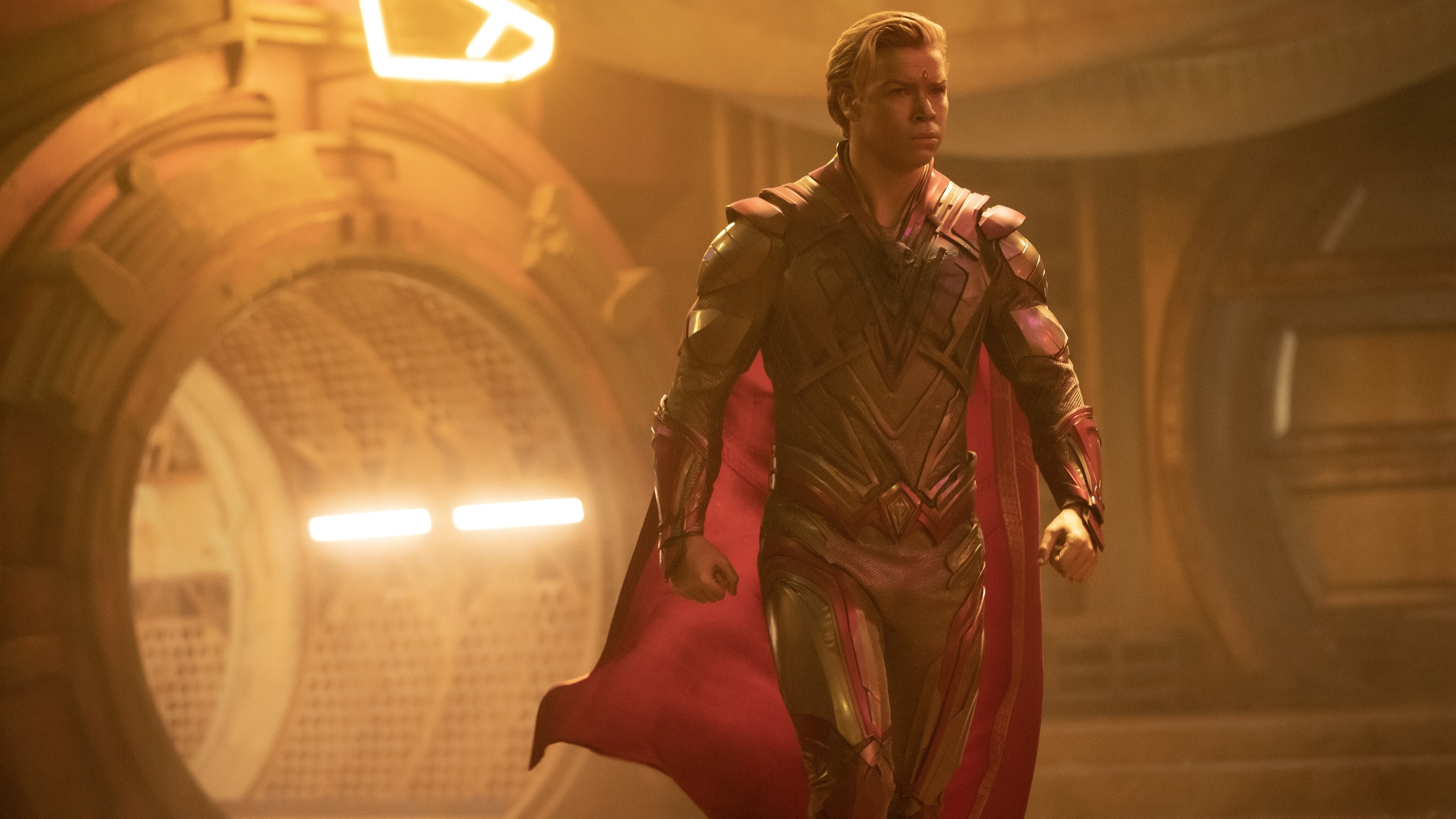
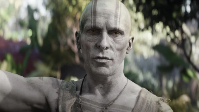
This contrast between conventional aesthetics of beauty and ugliness also drives much of the humour in the film. Part of this occurs through the various fights with Adam Warlock (Will Poulter). Adam is an adonis. With golden skin and a conventionally attractive physique, Adam is an incredibly powerful being created to be aesthetic perfection. Yet throughout the film he stumbles to live up to these high standards; while he was immense power, his immaturity leaves him prone. Adam’s presence in the film serves as a counterpoint to the various cross-species interactions throughout the film, including the Guardians. In the apex of the climax, Peter (Chris Pratt) is caught adrift in the cold vacuum of space, where his face becomes bloated and distorted. He is soon rescued by Adam, his golden visage unperturbed. This contrast between conventionally and unconventionally attractive serves as a kind of thesis statement, as both men are/become Guardians. Conventional standards of beauty need not apply (though, of course, Pratt’s face reverts to Hollywood normal by the end of the film.) Instead of the conventionally beautiful, GotGV3 asks you instead to find kinship with those deemed ugly.
Adam Warlock (Will Poulter) is framed as the aesthetic ideal by the High Evolutionary, yet he often bumbles about as he tries to find his place in the galaxy.
This destruction of aesthetic hierarchy is further emphasized in Rocket’s brief encounter with his friends in the afterlife. Crucially, as Rocket reconnects with Lylla and his other friends, they still have their cyborg bodies. Instead of some restorative heaven, which would posit a value hierarchy of “natural” bodies over cyborg bodies, the film again asserts the value and of cyborg bodies, even if their bodies and their mechanical integration rubs against conventional standards of aesthetic beauty. These bodies matter. These beings matter.
The destruction of aesthetic hierarchy also follows a concomitant destruction in life hierarchy that situates human(like) beings as superior to other life forms. Indeed, the defeat of the High Evolutionary (note the hierarchy in his name), a human obsessed with creating and controlling the perfect species of life, is a rebuff to his ideology of hierarchical forms of life. A similar rejoinder occurs near the end of the climax. At Rocket’s insistence, the Guardians rescue all the Earth animals caged by the High Evolutionary alongside the other rescued species. As they flee the High Evolutionary’s stronghold to the Guardians’ headquarters of Knowhere, one Knowhere resident remarks that he thought they were only taking in “higher life forms.” (It’s literally a save the frames or save the animals movement à la Super Metroid). This quote is perhaps a bit ambiguous. Is this the film reasserting the anthropocentric hierarchy of life (humans>animals), or, in explicitly bringing up this idea, is the film interrogating it? My interpretation is the latter, as while this statement is quickly washed away in the sea of animals seeking refuge in Knowhere.
GotGV3 also introduces Cosmo, a psychic dog, as part of the Guardians, who plays a crucial role in helping the fleeing species seek refuge in Kowhere. We first encounter Cosmo in the GotGChristmas Special (2022).
Furthermore, Haraway argues that making kin cannot be a merely abstract move, but instead it is “always situated, someplace and not noplace, entangled and worldly” (2016, 4). Indeed, in the film’s climax, a massive move to make kin as numerous beings seek refuge at the Guardians headquarters, this migration is not Nowhere, but Knowhere, a place where people can know each other, a space for knowledge and relationships with all kinds.
In Staying with the Trouble, Haraway observes that “Right now, the earth is full of refugees, human and not, without refuge” (2016, 100). This film is about rescuing refugees, providing home for those with lost homes and families. More broadly, the series itself has been about finding refuge in storage places, as the Guardians forge their own families, with many walking away from abuse towards nourishing kinship with other species. A heterogenous assemblage of human, animal, alien, and plant, the Guardians foster refuge for those who cannot protect themselves, making kin with species across the galaxy.
To begin, this is a series of observations on Thor: Love and Thunder (Taika Waititi, 2022) that are based solely on the film at hand. Having just watched it, I suspect the film originally was a bit heavier in tone. But Disney may have seen this, got cold feet, and ordered a reworking to imbue (or rather, flood) the film with levity. Again, this pure speculation on my part, but I would believe it given the product at hand. [Edit: having read a bit more on the film, it’s more likely that Waititi had way too much on his plate this year, and the film is a bit weak as a result. Still, Disney’s aversion to difficult, material stakes in the MCU is a consistent issue, and this film is no exception.]
First off, this film has four editors. That’s a surprising amount! Most only have one. This may suggest (again, just reading tea leaves at this point) that multiple edits were done to get the tone that Disney wanted. This would correspond with some of the choppiness of the film. The first scene with Gorr pre-God Butcher mode is rather effective. But then the cutting gets too choppy, and it partially disrupts what is a compelling moment as Gorr is face to face with the god he worshiped, only to find this god uncaring and unkind. In a later scene as Thor, Jane, and Valkyrie discuss how to rescue the kidnapped children, the coverage on the dialogue seen is quite stretched. A few shots here and there go on a bit long for a reaction shot, and its feels more apparent that this scene had to be stitched together either with a dearth of materials, or received rewrites which required dropping key bits of dialogue.
Second, there is the matter of tone. This film is afraid to truly explore the darker, heavier aspects of its plot. Many reviews have noted that the film is constantly throwing jokes at you, afraid you’ll leave if anything becomes too serious. But this film should be serious! Jane has stage 4 cancer, and is doing chemotherapy, but at the beginning of the film, she looks completely normal, not an emaciated wreck. Valkyrie gets stabbed and almost dies! Children are kidnapped and kept in a cage! Gorr witnesses the needless death of his child, and that an all-powerful god did nothing to stop it. This is some heavy stuff, but the film haphazardly engages with this material. When the film finally does decide it can be serious (as Thor, Jane, and Valkyrie visit the Shadow Realm), its electric! It’s a shame the film was too timid to do so earlier. Even after Valkyrie gets stabbed, there is no pretense of her injury. We do not see her in pain; instead, she jokes that if she were to go to the final battle, she would probably die. Another moment robbed of its power through misapplied levity.
Third, there are thematic connections that are often more implied rather than explicit. Both Jane and Gorr have weapons that empower them, but are slowly killing them in the process. Gorr’s endures the trauma of his child’s death, yet he steals children away. The bones are here in the film, yet the film feels afraid to bring this material explicit to the surface. But doing so would make the film that much more powerful. Why not have the stolen children ask why Gorr has taken them, and perhaps get him to question his own actions, only for the cursed sword to drown out any doubts? This would strengthen these thematic parallels, while also adding extra dimension to the character. But engaging with these themes (which are darker in tone) would require grappling with the darker elements of the story, something this film cannot do, for whatever reason.
Since the bones of these themes are still in the film, I do think the ending sticks the landing. Thor had his heart closed off, but in reconciling with (and eventually letting go) Jane, he is able to open his heart again to a new person, Gorr’s revived child. There is some compelling stuff here, but the film is afraid to linger on it too long, lest the audience who loved Thor: Ragnarok (Waititi, 2017) miss the fun adventures of that film. (Of course, Ragnarok had levity and drama, but it’s mostly remembered as a fun romp.)
I don’t know the behind-the-scenes gossip of the production of this film, but given the film’s handling of editing, tone, and theme, I get the feeling Disney ordered multiple edits on this film, resulting in some of the mishmash we see here. Perhaps this happened at the writing stage, punching up a script with jokes with excising the drama in an attempt to replicate Ragnarok‘s success. (There were also rumors of re-shoots with Christina Bale a few months before the film’s release, but these are unconfirmed, and re-shoots for large productions like these aren’t uncommon.)
But perhaps in the end this post is not an accusation, but instead a reflection on what could have been. In the film, Thor admits he holds people at a distance to avoid pain. This film, too, holds its subject matter (death, grief, despair) at an arm’s length, too afraid to truly embrace what it’s all about. But while Thor learns to embrace the pain as a part of life, this film never truly does.
I’ve published another video essay, this time on colorism in the Disney Channel original series The Proud Family (2001-2005, Created By Bruce W. Smith). Pasted below is a transcript of the video as well.
This video discusses imagery that perpetuates racism; viewer discretion is advised.
The Disney Channel original animated series The Proud Family is in the news recently, as a revival of the early 2000s show is set to debut on Disney+ this month. With its announcement has also come a good deal of hype; for example, its list of guest stars is a who’s who of black entertainers currently working in media industries today. The new series has also gained attention for its more … expansive take on black representation, including a new gay couple played by Billy Porter and Zachary Quinto.
All this hype and discussion of what makes for good black representation in media also makes it a prescient time to take a candid look at the original animated series and its forms of representation. This video examines the pervasive colorism in The Proud Family.
I’m not the first person to make a video about this topic by any means. There are a number of black women and men who have talked about the limitations of The Proud Family on YouTube, and I recommend you check out some of their videos as well for their perspectives. I’ll link some of these videos below for further watching. What I want to add to the conversation in this video is how the animation of the show also works to perpetuate colorism. With this knowledge, we can evaluate Louder and Prouder and see if the series’ creatives have changed their approach to depicting blackness on screen.
Positionality
Before diving in, I want to acknowledge my positionality to this material. I’m a white settler scholar currently based in Tiohtià:ke. The series aired on the Disney Channel when I was growing up, so I have some history with the show, but it did not serve as a foundational text the way it did with others. In discussions of the show on YouTube, I find there are a lot of mixed feelings around the series. On videos critiquing The Proud Family for its colorism, there are a lot of comments caught in this tension, recognizing that the series was foundational to their youth, but also recognizing how its problematic as well.
My intention here with this video is to help share analysis of racial representation in film and media more broadly, while adding my own research on animation to the discussion. Much of the discussion on YouTube and elsewhere has been narrative based; this video will add a material analysis to the discussion as well, one attentive to the series as an animated work.
For this analysis, I will be building the work of Catherine Knight Steele, an assistant professor of communications at University of Maryland – College Park. Her article “Pride and Prejudice: Pervasiveness of Colorism and the Animated Series Proud Family” tackles the under researched topic of colorism in media, particularly children’s media.
This video will first talk about what colorism is, then examine colorism in The Proud Family by analyzing the show’s characters. It looks at how both the writing and animation of the show work in tandem to reinforce colorist ideas of beauty and wealth. The video will end with some closing thoughts on how this show can help us rethink our contemporary discussions of representation.
As an animated series, The Proud Family has a lot of flexibility in what it can depict through the medium of animation. As Steele puts it, “In an animated series, producers and animators do not face the material limitations that are often used to justify patterns of exclusion of darker skinned individuals in Hollywood and on television. …animation largely provides the possibility to construct our desired reality” (57).
Animation artists have near if not complete control in the way they approach their work, from designing characters to framing them on screen. So what kind of approaches did The Proud Family creatives choose?
Defining Colourism
To begin, we need to define some terms, namely what is colorism. Margaret L. Hunter, professor of sociology at Mills College, provides a useful definition of colorism in her book Race, Gender, and the Politics of Skin Tone (2005, Routledge):
“White racism is the fundamental building block of colorism, or skin color stratification, among Mexican Americans and African Americans. The maintenance of white supremacy in [America] is predicated on the notion that dark skin represents savagery, irrationality, ugliness, and inferiority. White skin, and thus whiteness itself, is defined by the opposite: civility, rationality, beauty, and superiority. These meanings are infused into actual body types to create the system of racism as we know it today. Skin color and features associated with whites, such as light skin, straight noses, and long, straight hair, take on the meanings that they represent: civility, rationality, and beauty. Similarly, skin colors and features associated with Africans or Indians, such as dark skin, broad noses, and kinky hair, represent savagery, irrationality, and ugliness. The values associated with physical features set the stage for skin color stratification” (Hunter 9-10).
As Steele points out, “Colorism is a worldwide phenomenon of discrimination wherein people are given certain status and privilege based on the physical features of skin color, facial features, and hair textures. Within the African American community this is a topic with a long and painful history and with lasting implications” (53). For more on this topic, I recommend Khadija Mbowe’s video on colorism.
And this is where media comes into play. Media is powerful in its ability to either disrupt or reinforce these systems of power, systems that rely on stereotypes to reproduce the building blocks of white supremacy. Mass media such as television is especially important here in its ability to reach millions of people over time, children’s television especially so.
This is the context from which Steele approaches The Proud Family. Created by Bruce W. Smith, the series aired from 2001 to 2005 on the popular American television cable network, The Disney Channel. In her analysis, Steele identifies pervasive colorism in the series in both the design and narrative framing of its characters, finding colorism in the show’s ideas of beauty and socioeconomic status.
Beauty
When you look at all the characters of The Proud Family, how they are designed, and how they are narratively framed, it’s clear there is a division based around skin color, hair texture, and facial features. Characters with lighter skin, straightened hair, and more Eurocentric facial features are framed by the narrative and the camera as more desirable, while characters with darker skin, natural hair, and more afrocentric facial features are framed as not desirable, or even monstrous.
Examining the characters in detail, both their narrative attributes and character design, illustrates how the series perpetuates colorist beauty standards. We can start with Penny, the main character of the series, and Trudy, her mother. As Steele notes, these characters are some of the most multi-dimensional in the whole series, and we are meant to empathize with them; and notably, they are also characters with many Eurocentric features. Both women have straightened hair as opposed to natural hair; they are also lighter skinned.
By contrast, Penny’s best friend Dijonay, is darker skinned with more afrocentric features, and is framed as comic relief. She is the most overtly sexualized, with her midriff exposed. As Steel describes, “Dijonay is short with a thicker build. She has large lips and dark skin. Her hair is blonde. This subtly illustrates Dijonay’s attempt to enact the White standard of beauty, though she is unsuccessful in her efforts” (Steele 61).
A running joke of the show is Dijonay’s undesirability. She constantly flirts with Sticky, another friend, only to be turned down every time. Dijonay is routinely the butt of the joke that she is unsuccessful in love. Steele also points out that Dijonay’s personality is also stereotypical for darker skinned women. She writes that “Dijonay is depicted as loud, mean, and aggressive. Some may argue this is the reason for her lack of success with romantic partners. Yet, we must explore why the character with more Afrocentric phenotypic traits is also the character we interpret as aggressive and loud … [Ultimately], the representation of this character devalues Black women on the basis of skin color, relegating darker skinned women to supporting roles and reifying stereotypes about the deviance of Black women from traditional notions of femininity” (Steele 61).
Between these two main characters, Penny and Dijonay, we can see how colorist beauty standards manifests in the character design and narrative framing in The Proud Family.
We can see colorist beauty standards through side characters as well. One character where we see this at play is Deborah Williams, a guest character voiced by actor Vanessa Williams. Appearing in the season 2 episode “Ain’t Nothing like the Real Thingy,” Deborah has lighter skin, long, straighter hair, thin nose, lips, and body, and has large breasts. The show frames these Eurocentric features as more desirable, as the plot of the episode revolves around Penny thinking Deborah is seducing her father. Through the narrative, we are told this character who has lighter skin and more Eurocentric features, is attractive.
Through the animation and sound design, this message comes across as well, especially through camera movement when Deborah is first introduced. We the audience know from our consumption of Hollywood cinema that this vertical pan up a women’s body codes this woman as desirable. When we see the camera pans up Deborah’s body, we are told through this animated camera movement that she is attractive.
And that sound effect! I can’t get over how hard the aesthetics of the series are working to convince you this woman is attractive, literally to a cartoonish degree.
By contrast there are the gross sisters, Nubia, Olei, and Gina, a trio who are the bullies of the series. To me, the Gross Sisters are the most striking example of colorism in the series. It’s worth quoting Steele at length here to describe the characters and how their design perpetuates colorist beauty standards.
“Their skin is illustrated with a deep shade of blue, referencing the colorist pejorative phrase ‘blue black,’ used to describe the darkness of skin. Their thick hair is usually kept in braids and their body types are either much larger or much smaller than the typical European ideal. The illustrators use dark skin color as an indicator of fear and ugliness. The last name assigned to the sisters, ‘Gross,’ explains to the audience that they cannot and should not be considered physically appealing” (Steele 60).
I’ll add to Steele’s analysis here and point out that the gross sisters also have prominent overbites in their character design. Even when they aren’t speaking, their teeth constantly jut out in a visually unappealing way. Their teeth are covered in braces, which also seems a marker of their lower class status. Additionally, only one of the sisters, Nubia, speaks, the others are silent. As a marker of the monstrousness, Olei, the heaviest of the trio, is occasionally accompanied with animal growling. These animal noises frame her as other, as uncivilized and savage.
The series is upfront on what you are supposed to think of these young, dark skinned girls.
This is from the first episode of the show.
Speaking to Vogue, Dr. Yaba Blay explains the cultural context of this phrase: “Speaking as a Black woman, I know that, in the history of white supremacy, there is an investment in a particular level of presentation and performance of our value. Ash reflects that you don’t care about your appearance and/or you may not be able to care about your appearance.”
Sticky’s use of the phrase here indicates undesirability, a perceived lack of attention to appearance, and perhaps also points to the gross sisters lower socioeconomic status.
One thing that strikes me in how these characters are designed is that they are literally characters with blue skin, a non-human skin color. This visually marks them as other, as no one else in the show has unrealistic skin tone, just them. It’s worth pointing out that The Proud Family is a series that’s relatively down to earth …relatively. The series takes place in the real world. Penny doesn’t have magic fairies or superpowers; she’s just a young girl who goes to middle school and whose problems mostly stem from her overbearing father obsessed with protecting Penny from her adolescence. While the setting of the show is ostensibly the real world, the Gross sisters are blue, which seems to imply that the racist, colourist idea of “blue black” skin is also real, merely a fact of life, and not one of fiction.
The season 1 episode “Makeover” serves as a capstone for The Proud Family’s colorist beauty standards. Penny and her friends give Olay a makeover; her hair is straightened, her braces seemingly removed, and her body is shaped more like an hourglass shape, just like Deborah Williams.
29) Looking at these characters, we see how The Proud Family produces colourist ideas on what makes someone beautiful. Characters with lighter skin tone and more Eurocentric features, in other words, characters with traits closer to whiteness, are discursively framed as more desirable, while those with darker skin tones and more afrocentric features are not. This discursive framing is not just narrative, but aesthetic as well, through the animation’s character design and camera movement.
Socioeconomic Status
While colorism manifests in beauty standards in the show, it also manifests through wealth as well. Characters with lighter skin and more Eurocentric features are more successful in their businesses, or more wealthy in general.
This dynamic is particularly present between Penny’s parents, Trudy and Oscar. Trudy has a stable career as a veterinarian. She also has a lighter skin tone than Oscar, and is typically framed as the more civil and rational one.
Oscar, by contrast, is a struggling pork rinds manufacturer who is comically terrible in his career, namely, that his pork rinds make everyone sick. Oscar is framed as more irrational or overly emotional. His calling card in the series, in fact, is yelling for his wife. Oscar is so prone to outbursts and yelling, a super cut of his yelling is 37 minutes long. He is constantly mocked by others around him, including his mother. As Steele points out, while he owns a business (which presumably means he has some business smarts), he is usually framed as less intelligent, and in one episode from season 2, “Behind Enemy Lines,” is constantly mocked for his lack of wealth.
This link between darker skin tone and lower socioeconomic status is also seen with Dijonay. As Steele points out, “Dijonay is both darkest and has the lowest socioeconomic status. This is demonstrated by constant references to her apartment, which is too small to hold her many brothers and sisters and her inability to afford many of the luxuries in Penny’s home” (Steele 62).
As a final example of colorism’s socioeconomic dimension, we can look at LaCienega Boulevardez and her family.
So… LaCienega is the worst. She is self-absorbed and constantly manipulates people around her. She also constantly bullies Penny whenever she can get away with it. The creators of the show label her a frenemy, but she’s really just a bully.
As Steele points out, LaCienega has the lightest skin, the thinnest nose, and the longest straight hair of all of Penny’s friends. She and her family are also the richest characters, and LaCienega uses her class status as a means to dismiss Penny throughout the show. LaCienega has access to a significant amount of wealth that Penny and her friends just don’t.
Also, Her mother is a cop.
In sum, The Proud Family aligns the divide between lighter and darker skin tones with wealth, illustrating that the series relies on colourist notions of not only beauty, but socioeconomic status as well.
Watching episodes of this series, there is so much I found I wanted to talk about; its weird take on the matrix which completely subverts the revolutionary politics of the film in a heavy handed screed against piracya and the way the series is often cruel to Penny to a point where it’s honestly unsettling. But I will take time to point to one scene from season 1 episode “Strike” that’s quite revealing of the show’s politics. What’s striking about this scene (no pun intended) are two things : first, it misses the obvious joke to make here, which is for Penny to say, “I don’t need to do my taxes, I don’t have a job!” After all, she’s 14 and in middle school. And second and more importantly, this is not a joke. It’s a statement of fact. It serves as an important index to the actual politics that guide the series as a whole.
Conclusion: Plastic Representation
With contemporary movements in Hollywood such as #oscarssowhite, we’ve seen a recent focused effort to increase opportunities for people of colour on and off screen. This important work is often summarized with the phrase and hashtag “representationmatters.” This phrase, however, often flattens this discussion of representation onscreen to merely a number.
In her article for Film Quarterly, film professor Kristen J. Warner outlines what she calls plastic representation: “plastic representation can be understood as a combination of synthetic elements put together and shaped to look like meaningful imagery, but which can only approximate depth and substance because ultimately it is hollow and cannot survive close scrutiny.” Warner notes she uses the phrase plastic here, as it refers to both shallowness and malleability.
Plastic representation frequently occurs when the conversation around diversity begins and ends in the casting stage. In an interview with the Chicago Tribune, Warner notes that when discussions of representation only happen at the casting level, that’s a form of plastic representation.
The Proud Family, and Disney’s promotion around the series for Disney+, serves as a great example of Warner’s concept of plastic representation. In the online series Disney+ Deets, hosts Kenneth Brown and Marcellus Kidd fondly remember The Proud Family for its representation.
While these hosts mention one off episodes the show did, such as an episode on Kwanzaa, the focus of such representation seems to be quantitative, the sheer number of black and other people of color characters on screen. But as I’ve demonstrated throughout this video, the issue with this series is qualitative, the actual form and function the representation takes. And this issue of qualitative representation extends to the latest continuation of the series. In regards to the announcement of a same sex couple, black critics have questioned why a Black gay man needs to be paired with Whiteness. As Torrey Deuce puts it, “Not every Black queer person has to be paired up with the House of Colonization.” Dr. Alfred Martin, who studies gay Black representation on television, points out that this couple in informed by what audiences the creators think will be watching the show.
Steele surmises that “The Proud Family is a children’s show that celebrates the African American family and offers diverse views of the Black community. Yet it still relies heavily on colorist notions when dealing with both beauty and socioeconomic status” (63). While Disney+’s promotional content frames this show as a win for representation, I don’t think that’s fully the case. As Catherine Knight Steele writes, and as I hope I’ve demonstrated here, the original Proud Family is a clear example of colourism in television, and is a particularly useful example for thinking about how animation as a medium can reproduce colourism as well.
Since The Proud Family originally aired, there’s been a bevy of animation that illustrates the medium’s ability to capture nuanced and beautiful black representation in film and television. There is even animation that illustrates you can use non-realistic color for humans without falling into the trap of colourism. All these examples show that The Proud Family didn’t have to look this way.
Just in terms of visual appeal, the animation in The Proud Family: Louder and Prouder, seems much improved that the original. The original series was produced by a lot of people who were new to animation, and, yeah, it shows; aesthetically The Proud Family has aged rather poorly, colourism and otherwise. Louder and Prouder is certainly a much needed revamp, with saturated hues, detailed textures, and expansive lighting. I think the big question is if a visual upgrade is enough to avoid repeating its past history of colourism.
As of this writing, only a few trailers have dropped for the new series. For me, a strong index of whether the series has grappled with its past colourism is whether the Gross Sisters are still included, and if they still look the same. After all, their visual treatment throughout the original series was rather shocking in how these young girls with darker skin tones were persistently othered by the series. If they are included with the same character design, I think it would throw into question Louder and Prouder’s claim towards bringing good black representation. Welp, I guess we’ll see.
That’s for watching this video. There is so much to say about The Proud Family, so I tried to just keep my discussion to colourism for today. One idea I want to examine in the future is children’s tv that examines labor strikes, such as The Proud Family and Hey Arnold. Leave a comment in the chat if that’s something you’d be interested in, and let me know your thoughts on The Proud Family overall. Until next time!
Sources:
Margaret L. Hunter. Race, Gender, and the Politics of Skin Tone. Routledge, 2013.
Catherine Knight Steele, “Pride and prejudice: Pervasiveness of colorism and the animated series proud family.” Howard Journal of Communications 27, no. 1 (2016): 53-67.
I was recently reminded if the work of animator Nina Paley, best known for her remixed retelling of the Ramayana in her animated film Sita Sings The Blues (2008). She is also well know for her TERF viewpoints, going under the guise of being “gender critical.” This is patently clear in her public persona (tweets, interviews, etc.), but also manifests in her animated works as well. In this blog post, I want to talk about how Paley’s TERF ideology is visible in the aesthetics of her animation.
For those unfamiliar with the term, TERF stands for Trans Exclusionary Radical Feminists, though calling TERFs feminists is really a misnomer. While TERFs claim to be feminists, their exclusion and vilification of trans people demonstrates that their ideology is not feminist at all. This article by Vox gives a good overview of the recent rise of TERFs, while this video by Contrapoints does a good job in critiquing key TERF talking points.
I’m going to focus on two key elements of TERF ideology that Paley’s work often depicts: 1) the reduction of womanhood as suffering and pain under the patriarchy, and 2) a fetishization of heterosexual reproduction and fertility.
The reduction of womanhood to pain and suffering under patriarchy is something that runs through TERF ideology. TERFs misappropriate righteous anger towards patriarchal institutions, and and imbues it into their own identity as a means of producing the illusion of an “authentic” feminist identity. The logic of TERFs is that trans people cannot actually experience the same suffering under patriarchy, as, in their minds, trans women are not actually women. Thus, in TERF ideology, trans people who identity as women are really privileged men imposing on women’s spaces. By this TERF logic, trans women cannot truly be oppressed, as they fundamentally cannot suffer the same way as cis women do under patriarchy. This aspect of TERF ideology is in part what makes the ‘exclusionary’ in Trans Exclusionary Radical Feminists, while also reifying womanhood as suffering in TERF ideology. To be a woman is to suffer, say TERFs, and trans women cannot suffer like we do.
The correspondence between pain and womanhood occurs in Paley’s animated work, particularly Sita Sings The Blues. As indicated by the title of the film, Sita of the Ramayana is frequently saddened by her dismal state of affairs (see Figure 1). The plots of Sita Sings The Blues and Paley’s later film Seder-Masochism (2018) fundamentally revolve around the subjugation of ancient female figures goddess figures (Sita; the goddess of Seder-Masochism). Sita’s identity is one fundamentally constructed by men around her; she is kidnapped, and later must continually prove her faithfulness to her lover, Rama. By the end of the tale, Sita proves her love and devotion a final time by throwing herself into the Earth, where she is promptly swallowed up. Here we see the limits of TERF ideology; the obsession with women’s subjugation under patriarchy prevents any space for narrative resistance.
Figure 1. Sita cries at night in Sita Sings The Blues.
TERFs also fetishize aspects body features typically aligned with feminine identities, such as breasts and vaginas, as these are framed as ‘immutable’ facts of gender ontology. This aligns with TERF ideology that to be a woman is to be biologically determined by your sex (i.e. genatalia). The ability to give birth is thus fetishized as a unique experience of womanhood, and is particularly reified as a means to exclude trans women from cis women in feminine identity formations.
This fetishization of feminine-coded body parts is demonstrable throughout Paley’s work, and is likely her defining aesthetic. The aesthetics of her film are extremely flat; she typically animates still images in a technique similar to paper cut out animation. Figures tend to be more abstract in form, sometimes made through mixed media appropriation and reanimation. In designing women, Paley’s aesthetics are very particular in their fetishization of feminine-coded body parts. Women’s breasts are typically quite prominent, usually forming perfect or near-perfect circles in an aesthetic depiction of the ideal female form. In the collaboratively animated film The Prophet (2014), based on the book of prose poetry fables by Kahlil Gibran, Paley animates a section which uses here cutout animation style to celebrate the joys of female fertility, reproduction, and parenthood (see Figure 2). In one sequence, Paley animations a lineage of heterosexual reproduction, fetishizing women’s pregnant bodies as they give birth to others in patterned legacy.
Figure 2. Paley’s animated section in the collaborative animated film The Prophet (2014). Paley’s section focuses on the celebration of parenthood and female reproduction.
Similarly, Paley’s more recent film Seder-Masochism likewise fetishizes the female form. The film is a reinterpretation of the events in The Book of Exodus; as Paley describes, the film is ultimately “about patriarchy and the suppression of the Goddess.” Paley’s aesthetics reducing women to TERF fetishization of biological essence: wide hips, breasts, and vaginas (see Figure 3). The image of woman are reducible to primary and secondary sex characteristics.
Figure 3. Nameless female figures dance in Seder-Masochism (2018).
The film also animates ancient sculptures and other artifacts that depict the female form, such as the Venus of Willendorf (see Figure 4). In including and animation ancient forms of feminine bodies, Paley is envisioning an imagined lineage of women, one that by definition excludes trans people with the idea that transgender people are a new “aberration” to society and its conception of gender. In aesthetic fetishization of breasts and other feminine-coded bodies parts, Paley renders her TERF ideology clear. TERFs fetishize the ‘traditional’ female form as a stable site of identity, one of patriarchal oppression dating back centuries. In animating ancient tales of women’s oppression, Paley’s work gestures to an imagined lineage of women, a lineage biologically determined through heterosexual reproduction, one threatened by the existence of trans people, whose existence threatens the core of TERF ideology.
Figure 4. In one scene of Seder-Masochism, Paley envisions ancient goddess worship by animating the Venus of Willendorf.
On first impression, Paley’s work and its depiction of women’s bodies has a veneer of feminist image making. Such images of women would appear to stand in contrast to filmmaking predicated on the male gaze, which frame women as objects of consumption rather than active subjects. Upon closer inspection, however, it’s clear that these images correspond and support a virulently anti-feminist worldview, one that idealizes and fetishizes the female form as a means of rendering and reifying TERF ideology. Paley’s work may seem as an antidote to the male gaze of classic cinema, the kind of filmmaking critiqued by Laura Mulvey that frames woman as object. But you know what? At least the male gaze is honest.
Nate tries to psyche himself up in Episode 5 of Ted Lasso. Source: Apple
If you aren’t watching Ted Lasso, you should be. This excellent Apple TV+ series is funny, heartwarming, and genuinely incisive in its politics. I want to dissect Nate’s arc in the most recent episode to examine his toxic behaviour and his experience of racism in this episode, the latter a topic critically under discussed.
To begin, a brief recap of the character and his plot in this episode. Nate is a man of colour who is an assistant coach to the British soccer team AFC Richmond; previously, he was the kit-man (aka an equipment manager). In this episode, Nate wants to celebrate his parent’s 35th anniversary at “A Taste of Athens,” a local, mid-tier restaurant. His initial attempts to get the window table at the restaurant is denied. He seeks advice on projecting strength in public spaces from his white female colleagues, Rebecca and Keeley. That evening, his parents arrive at the restaurant, and are seated in the back. Nate takes a moment to psyche himself up in the bathroom, before firmly demanding he and his parents be seated at the window table, which has sat empty this whole time. The server concedes, and Nate and his parents have a nice dinner at the window table.
This episode is quite revealing to Nate’s anxieties around his role in life: in public society, with his parents, and on his team. Nate’s moment of solitude in the bathroom is quite revealing in how he fights to re-situate himself in all three contexts. Looking in the mirror, Nate initially tried to embody his the psyche up move Rebecca uses, which is to make yourself as big as possible, as if trying to scare away a bear. Nate tries this, but ultimately this does not work for him. He instead stares himself in the mirror, and spits in his reflection.
Film Crit Hulk writes that this moment is an expression of anger, that Nate can feel big by finally releasing some buried emotions. I agree, but I also want to look closer at this moment through the lens of his arc this season. Throughout this season, Nate is worried about his place in the clubhouse, and takes up some elements of toxic masculinity in an attempt to secure his place. He is mean to his replacement kit-man, replicating the exact kind of treatment Nate received in the locker room. I think Nate believes that his replacement needs to go through the same derision and be put in his place, because that’s how it’s always been. Again, this is the logic of toxic masculinity, that you must secure respect through dominance of others. In this private moment in the bathroom, Nate agains puts someone in his place, spitting in the face of his (shadow) self. In the aggressive spit, he puts someone down to assert control. In other words, Nate steadied himself and made himself “big” by psychologically putting down someone else. That Nate spat in his own face in the reflection does perhaps trouble this reading a little bit–how can he both put himself down and make himself big at the same time? That it is a reflection, however, not the true self, put perhaps a reflection of the old self, the old Nate who was disrespected in the locker room, is why I think the spit functions as a means of a put down. For Nate, who’s been expressing traits of toxic masculinity here and there throughout the season in an attempt to be “one of the guys,” he may only truly understand power through the domination of others. This is something I expect will be challenged and ultimately broken in this season by Dr. Sharon Fieldstone, the teams’ sports psychologist.
From my search on recaps of this episode, it appears that no one is talking about race with this episode. Make no mistake, racism is a key reason why Nate doesn’t initially get the window table at the restaurant. I think the series plays its cards here very close to its chest, creating a situation emblematic of what many BIPOC individuals face in their lives. Were there really no more reservations, or does the restaurant not want people of colour at their establishment? Did they really not take reservations for the window table, or did “A Taste of Athens” not want people of colour at the street view window? That the server went back to management to check on window reservations is, I believe, a surface gesture to hide the true purpose: to deny BIPOC guests the best seating at the restaurant.
Further interactions in this episode support this interpretation. Rebecca is surprised, for example, that Nate can’t get a table for a restaurant as pedestrian as “A Taste of Athens.” This is the not the expensive posh restaurant that she anticipated. That the server sprays what appears to be cleaning fluid in the air when Nate enters the restaurant is an inconsiderate move that arguably indicates how Nate is unwelcome in the space. That Nate even promises his family will be out of the restaurant in a timely manner if they get the window table suggests he is aware of how unwelcome he is in the space. That the server Jade says “I’m Picky” in rejection of Nate asking for her phone number is again the series playing close to its chest—is she really “picky” or is she using this as an excuse to not consider a man of colour? In avoiding explicit racism, the kinds we are use to seeing on the screen, I think the series plays well to invite audiences to consider how racism manifests subtly and obliquely in common life.
I understand if the reader is skeptical here, thinking I’m being too paranoid with this analysis. Indeed, I am doing a paranoid reading here. As Eve Sedgewick writes, the paranoid reading is an important interpretive tool. We live in a fundamentally inequitable world, one structured by the imperialist, white-supremacist, capitalist patriarchy, as bell hooks notes. A paranoid reading is one that looks towards hegemony and this affects, one that sheds light on issues of inequity.
Potential Spoilers: My Predictions for Ted’s arc this season:
I’m listing out my predictions for the series major emotional arc with Ted not as easter egg sleuthing that many a Marvel fan does when dissecting trailers, for example. Rather I want to put these thoughts to digital paper to fight back against the comments that season 2 of Ted Lasso has “no conflict.” The conflict is there, it’s less visible because it is the conflict of repression and anxiety.
I predict that Ted’s father will be revealed to have committed suicide. We know that his father died when Ted was 16. Ted mentions in an early episode this season that his father took on and was burdened with a lot of hurt, perhaps too much. This is also foreshadowed with Dr. Sharon’s mention that her favourite book is The Prince of Tides which is a football coach moving to a new town, dealing with a suicidal sister, and unearthing family trauma and its current effects. Sounds a lot like Ted’s situation now!
Ted lost his father early; as a result, he wants everyone to like him to ensure people won’t leave him. I believe his behaviour ultimately stems from a fear of abandonment. Now, Ted does genuinely care for others, and makes for a great coach in terms of motivation and team-building. But it’s clear the limits to toxic positivity and perhaps also his worldview of “rom-communism” (i.e. think of your life as a rom-com.) Yes, everything will work out, but this doesn’t mean you shouldn’t confront your trauma, Ted!
This is why Dr. Sharon is so important this season. It’s clear she recognizes Ted’s issues; her keen observations lead her invite Ted to talk with her. She recognizes his behaviour for what it is. He hasn’t accepted her invitation…yet.
Anyway, thanks for coming to my Ted Talk. I hope this motivates you to watch this gem of a series.
Well, I’ve done it. I’ve made my first official foray into video essays. Hope you like it! Pasted below is a transcript of the video as well.
Why the latest Attack on Titan opening hits different
Intro:
The anime Attack on Titan is in its final season, and with it comes a fascinating new opening sequence that is radically different from the rest of the series, in what appears to be attempts at an anti-war aesthetic.
Attack on Titan has been rightly criticized for its fascist subtexts. Much of the discourse, while valuable in critique of fascism, has been limited to narrative analysis of the series. In this video, I want to unpack some of the ways the anime supports fascist narrative subtexts through its aesthetics, and how this new opening sequence attempts to break from that tradition. This video will first 1) go back to the very first Attack on Titan opening sequence to unpack its aesthetics, 2) then contrast that opening to this new opening sequence of the anime, and 3) finally think about what these aesthetics mean for the series.
OP 1
In his book, The Anime Machine, East Asian Media scholar Thomas Lamarre describes two different tendencies of movement that frequently manifest in animation, what he terms cinematism and animetism.
Cinematism is an aesthetics of movement that replicates forms of cinematic realism through animation. It’s frequently characterized by realistic movement into depth or a recreation of cinematic space. Lamarre describes it this way:
“The essence of cinematism lies in the use of mobile apparatuses of perception, which serve (1) to give the viewer a sense of standing over and above the world and thus of controlling it, and (2) to collapse the distance between viewer and target, in the manner of the ballistic logic of instant strike or instant hit” (Lamarre, 2009, p. 5).
Animetism, by contrast, is an aesthetics of movement that is not necessarily invested in this kind of reproduction of cinematic space. It is a kind of movement in animation that often favours what Lamarre terms “open compositing.” Lamarre describes animetism’s use of open compositing this way:
“[Animetism] favors an “open compositing” in which layers of the image are allowed to move more independently of one another. While open compositing tends to work against sensations of movement in depth, it makes possible other sensations of movement” (Lamarre, 2009, p. 37).
Lammare proposes the following: what if instead of aligning our vision with cinematic exploration of space, pushing forward into space like the front of a train, we looked sideways.
Lamarre uses the example of looking out the side of a train as akin to the experience of animetism. Such a perspective favours lateral or sliding movement of layers as opposed to the entry into cinematic space that cinematism embraces.
We see this animetism at play in the beginning of the first Attack on Titan opening. As we watch the layers of the image move laterally, we see our main characters in dramatic poses. Contrast this to the later action sequence, where we see cinematism at play. The camera, and thus, the viewer moves like a bullet through space, as we watch the action unfold. In this sequence, the enemy is trackable, viewable, and overall knowable. The titan’s monstrosity is clear. Cinematism offers a controlled view of the violence, and a clear view of the strike.
Many of the action sequences in Attack on Titan rely on this kind of ballistic movement into space, usually occurring during scenes of military violence. This depiction of cinematic space, these aesthetics of movement in which we as the viewer are in control, aligns with the narrative embrace of militarism in the series.
2) OP 6
This kind of cinematic movement into space is in stark contrast to the newest opening.
The opening is disorienting. Puffs of coloured smoke often obscure the image, creating a flat effect. While we see aspects of animetism in the lateral moving of layers in certain sequences, we also see images of destruction that overwhelm and confound. While the first opening depicted aerial shots of an army, again, giving the viewer control, this opening places the camera at ground level, with the viewer seemingly at threat of being stomped by the army’s march. When I watch this opening, I see images that refuse comprehension. We as the viewer do not have the sense of control that cinematism gives us, instead, we feel like a target ourselves.
None of the characters in Attack on Titan are depicted in the opening sequence, with the scant exception at the very end of the opening, where we see the protagonist, Eren Jaeger in his attack titan form, petrified in stone. Ominous! The lack of anime characters here goes against anime’s media tradition, and counters the aesthetics of previous openings as well. Anime openings feature characters for a reason. Anime and its marketing is predicated on characters for their transmedia properties, what we call Anime’s Media Mix. Characters, after all, are key to generating merchandise to cross-promote the series. By not featuring characters, this goes against not only the aesthetics of the previous Attack on Titan openings; it goes against how anime markets itself, period.
On the aural level, the music is challenging, with heavily distorted vocals and lyrics difficult to parse. Whereas the first opening pumped you up for the action, this opening leaves the viewer unsettled and anxious.
—
Why is there such a dramatic change of movement aesthetics in this Attack on Titan opening? Production changes in part explain why. Studio WIT, who made their name creating the first three seasons of the anime, opted to not adapt the fourth season, with Studio MAPPA taking over production in their place. With the change in studio came a change of staff to key creative roles, and perhaps a change in perspective as well.
This season also starts at a remarkably different point in the series narrative, after a time skip of four years. We spend the first couple episodes with mostly new characters and a different side to the story that we were privy to earlier. In short, the narrative has changed drastically, and it seems MAPPA is combining this dramatic narrative shift with a dramatic aesthetic shift as well.
3) Conclusion
The French film director François Truffaut famously questioned whether it was possible to make an anti-war film, because any film that depicts war will perhaps inevitably sanitize and glamorize it. While it remains to be seen how this latest season of attack on titan as a whole will treat the fascist subtext of the source material, at the very least in this enigmatic and experimental opening sequence, we’re seeing a different approach to animation that I think is attempting a kind of anti-war aesthetic. Instead of the aesthetic embrace of cinematism, an aesthetic that (intentionally or not) aligns with the fascist subtexts of Attack on Titan’s narrative, we see imagery that resists viewer control, that brings the viewer into the impact of destruction itself. In short, on an aesthetic level, this latest opening sequence troubles our viewership position, and attempts to undo this kind of aesthetic embrace of violence the series is known for.
I hope this video has been informative in the ways in which animation aesthetics, in particular, movement, have an affective dimension that plays a part in the overall meaning of a text. If you found yourself confused or put off by the latest opening, hopefully this video has helped you understand why.
If you want to learn more about cinematism and animetism, the excellent youtube channel Pause and Select did a two-part interview with Dr. Lamarre on his work. Links in the description below.
If you liked this video, let me know by giving a like, or a comment, or a subscribe. Depending on how this little experiment goes, I might produce more videos in the future. Thanks very much for watching.
Pause and Select Videos:
Sources:
Tom Speelman, “The fascist subtext of Attack on Titan can’t go overlooked”
Gene Siskel Interview with François Truffaut, 1973
Thomas Lamarre, The Anime Machine:
Kim Morrissy, “Attack on Titan Producers Discuss Reason Behind Studio Change to MAPPA”
Marc Steinberg, Anime’s Media Mix
Audio + Video:
Attack on Titan (2013-present)
Beauty and the Beast (1991), Dir. Gary Trousdale & Kirk Wise
The Polar Express (2004), Dir. Robert Zemeckis
your name. (2016), Dir. Makoto Shinkai
Train stock footage provided by Videvo, downloaded from www.videvo.net
I’ve been a fan of Archer since its debut in 2009. It came at an important juncture in my life where everything had suddenly changes. I was in college, I had stable access to the internet; in short, I had the freedom to consume any kind of content I wanted. Archer debuted the same I started college, and was one of the first “adult” animated series I followed, watching the series on Hulu. For me, the series is one in a collage of memories where I slowly became my own person, pursued my own interests, and generally grew into myself.
I’m also a fan of idle tapping games. I literally unlocked every plant in Terrarium within a matter of weeks, and I was pretty active on Steven Universe: Tap Together before the game went defunct in 2019. So whenI got an ad for Archer: Danger Phone, I was understandably thrilled and downloaded the game right away. How much do I love this game? Well, I love it enough that I’m even putting in the effort of writing this short review!
The conceit of the game is that Krieger and his digital anime waifu Mitsuko (though she’s only called “anime bride” in the game) are running simulations on how to best promote his new crypto-currency, the Kriegerrand. As the game describes this is “All in the name of saving the economy… definitely not to make Krieger rich!”
The main goal is to play through these simulations, generating cash and Kriegerrands through a variety of means, from buying influencers to upgrading characters and situation rooms, all while watching your favourite Archer characters interact.
If you enjoy the grind of RPGs or Idle games (optimizing stats, upgrading characters, maximizing resources), you’ll enjoy this game. If you are an Archer fan, but are unfamiliar with idle games, this game is a nice stepping stone into the genre. Idle games are nice in that you have control in how actively involved you want to be. You can check in as little or as often as you wish to maximize your stats and resources, while also getting fun character interactions along the way.
Above: Interactions from the special event, “Long Pig.”
Speaking of interactions, this is a excellent entry into what we might term the Archer-verse. The nuggets of story, jokes, and interactions throughout the game that you unlock as you play are quite good, and fit seamlessly into the Archer universe. The level of writing is on par with the television series, which, if you’ve seen the show, is quite the compliment. This is because the writers of the show are involved in making this game and their storylines. Some stories are recycled from the television series, through from what i’ve seen so far, this is few and far between.
Above: The first simulation of Archer: Danger Phone.
Additionally, since I’ve started playing the game a few weeks ago, there has been a consistent stream of special events to keep the game interesting, even offering new perspectives on the series. A recent special event, taking place in the Archer: 1999 dreamscape, shows Ray’s storyline during the episode “Bort the Garj,” building a richer Archer-verse overall (Ray mostly spends time trying to put an ad for his courtesan services on Space Craigslist.) In other words, the game rarely bores, and adds to the world of Archer in cool and interesting ways.
The attention to detail throughout this game is—dare I say it?—impeccable. From the soundscapes, to the character animations, to the room backgrounds, the entire game captures the spirit of Archer perfectly. I appreciate the iconic horn blasts of the opening theme songs, to the smooth, jazzy background music. The flicker of the character models (they are hologram simulations, after all) is also a nice touch. You can see all these elements at work in the gameplay footage below:
Above: Gameplay footage taken on November 26, 2020. Note the layers of 3D objects within the simulation rooms that give the experience that these spaces are real and lived in by the characters.
To truly maximize your profit-generating potential, you have to watch some ads, and/or buy some Kriegerrands with real money. This is usually where idle games get a bit of flack. Idle games can be incredibly addictive, and paired with the option to spend real money, this can result in a dangerous combo for your wallet. Do you want to grind yourself, or treat yourself once in a while to an extra boost in resources? The best answer I can give here is play that suits you best, so long as you’re mindful of your wallet and don’t succumb to FOMO.
In short, I highly recommend this game. It is free to download with in-app purchases, and is available on both Android and iOS.